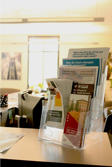

WELLCAT COUNSELING CENTER BROCHURE
PROBLEM
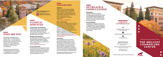
Create a brochure that concisely showcases the different services and programs within the WellCat Counseling Center while following Chico State’s branding guidelines.
SOLUTION
Student mental health services are crucial to college campus resources, and it’s vital to provide a brochure that is both eye-catching and informative.
Integrating the primary and secondary colors of red and gray, complemented by angular graphic elements, the brochure aligns closely with Chico State’s established style guide. With the amount of content given for each sector of the brochure, it was essential to organize all paragraphs, headlines, and graphics in a way that is both legible and understandable to every student who picks it up. The heading of each section is designed to draw the viewer's eyes using Chico State’s bold red color with a heavy-weighted typography to establish a strong hierarchy. Showcasing the scenic shots from around campus, the photography used is meant to evoke feelings of serenity and familiarity. The front photograph was chosen specifically to show students the building in which the WellCat Counseling Center is located.
PROGRAMS USED
Adobe InDesign & Photoshop
OLD BROCHURE


1ST DRAFTS

2ND DRAFT
3RD DRAFT

FINAL DRAFT


